kerry kerry boom boom! (![[personal profile]](https://www.dreamwidth.org/img/silk/identity/user.png) milkymoon) wrote in
milkymoon) wrote in ![[community profile]](https://www.dreamwidth.org/img/silk/identity/community.png) dreamwidthlayouts2010-09-16 03:07 pm
dreamwidthlayouts2010-09-16 03:07 pm
New Layout: Fix Ya Face (EDITED to accommodate resolutions 1024 x 768 and up)
This is a 2-column (left) Tabula Rasa layout - just copy and paste the CSS into your layout, and untick 'use layout's stylesheet' in the customise section. Tested in Firefox & Google Chrome. Rounded corners only work in Firefox, Safari and Chrome. Not tested in IE (don't have Windows), but I did put the layout in an IE testing website, and it appears okay.

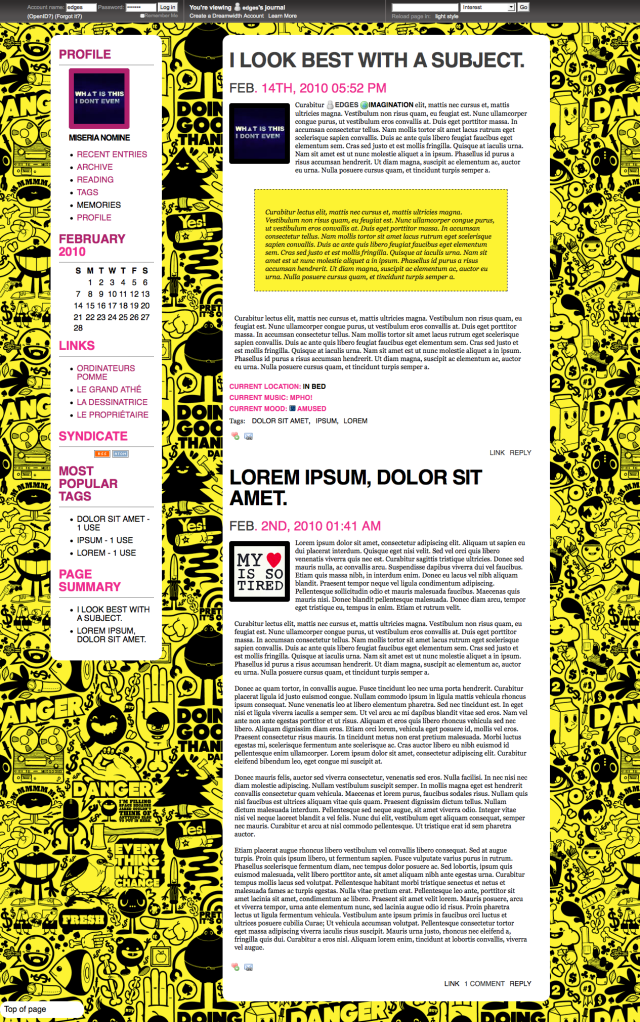
IMAGE PREVIEW LIVE PREVIEW
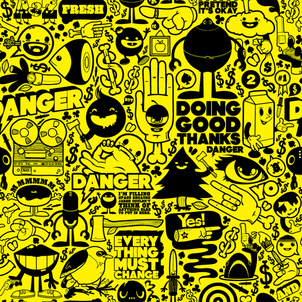
Please update the background image (yellowcomicbg.png) to your own host so that I can preserve my Photobucket bandwidth.
Feel free to edit colours and images, but keep the credit (tofascination or imagination)!
Code under the cut.
ETA, 26 Aug 2011: Comment section FIXED, at least on my test journal atedges!
IMAGE PREVIEW LIVE PREVIEW
Please update the background image (yellowcomicbg.png) to your own host so that I can preserve my Photobucket bandwidth.
Feel free to edit colours and images, but keep the credit (to
Code under the cut.
ETA, 26 Aug 2011: Comment section FIXED, at least on my test journal at
no subject
I'm glad to see some activity on the comm =D
Might I suggest a textarea box for easy coping/pasting?
[textarea] insert css here [/textarea]
Just replace the [] with < > :)
no subject
I'm glad you like it.
no subject
MOD
Re: MOD
no subject
no subject
no subject
no subject
The *only* thing I don't like is that it's not flexible for screen size (I don't know the technical term), I mean in that if my browser window isn't maximized, I'd have to use a side-scroll to see everything. (You know what I mean?) Is there an easy fix to adjust that? If I were to use a smaller background image would it make a difference? I do like it otherwise, though!
no subject
no subject
no subject
Also, I'm probably going to use the base design for other layouts in future, some of which will be lower on images and won't have the same resolution constraints.
no subject
Awesome. I look forward to seeing them! I'll probably plug this layout in at some point and just play around with it, see what I think of it with my own content and image tweaks and such, haha. It might just win me over anyway.
no subject
no subject
no subject
I discovered that longer comments made to my entries aren't wrapping properly, which screw with the main column width which in turn makes everything wonky.
Is there an easy fix to this, or is it a bug with DW in general? I took out the custom CSS for a second and things appeared to be normal with comments, but the problem returned once I re-installed the custom CSS.
I'm getting tons of compliments on the layout in general, though, it's definitely a winner!
no subject
no subject
no subject
Under the headings Profile and Style Credit, there is black text being obscured by the black background. I don't know where in the coding I would fix this, but could you please point out where I would change it to white.
no subject
.journal-name (line 549)
{
font-size: 12pt;
letter-spacing: -1px;
padding-top: 10px;
text-transform: uppercase;
font-weight: bold;
}
and add a 'color: #fff' (or whatever colour you want for your profile text'). Do this after the 'font-weight bold', but before the final curly bracket.
You'll also want to do that here and here:
.module-credit dt, .module-credit dd (line 569)
{
display: inline;
margin-top: 0pt;
margin-right: 0pt;
margin-bottom: 0pt;
margin-left: 0pt;
padding-top: 0pt;
padding-right: 0pt;
padding-bottom: 0pt;
padding-left: 0pt;
}
.module-credit dt (line 574)
{
font-weight: bold;
margin-right: 0.5em;
}
I hope this helps! (Sorry I got back to you so late; I've been quite busy!)
no subject
no subject